Click maps: Taking heatmap web analytics to the next level
What is a click map?
A click map is a type of heatmap that is a visual representation of areas of activity and engagement on a website or mobile app. It graphically shows what the visitor is doing on the page, and just as importantly—what they aren’t doing. Click maps show where someone is clicking on your page, for instance, a CTA or page link or trying to interact, and there’s no response.
On mobile devices like a phone or tablet, click maps, also referred to as touch maps, indicate where users tap or zoom, revealing where they interact with images, buttons, text or general page elements.

How does a click map work?
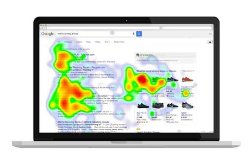
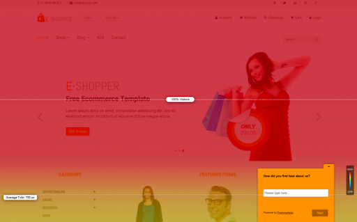
A click map shows areas of activity or engagement on a website or app using a graphical representation of data values through color. Typically, warmer colors like orange and red mean a lot of activity, whereas cooler colors show less. No color means zero engagement.
There are many types of click maps, and each one provides different web and app insights. Even better, these can be combined to get a fuller picture of analytics.
Below are some common heatmaps used together with click maps:
Attention heatmap: These heatmaps show how much time a user is spending on a page or app screen. It displays an aggregated view of the visitor’s page activity based on various interaction data. It includes the number of clicks, where they happened and mouse movements.
Scroll map: These visually represent how far users scroll down a web page or mobile screen, indicating the most and least viewed parts. A scroll map can help you determine the length of your web page and how much content you should show users before they have to scroll.

Hover maps: Also referred to as mouse or move maps, these types of heatmaps show you where a visitor placed their mouse, cursor or tapped, regardless if they actually clicked on an element. This can indicate how a user is reading or scanning a page or app screen before they engage with it.
Click maps vs. heatmaps
Though click maps contain considerable heatmap data, they provide much more information than a heatmap alone. Click maps offer richer data analytics and insights on UX performance and actions that measure effectiveness. You can pinpoint conversions and highlight underperforming areas for improvement, along with seeing granular data breakdowns.
Here are some limitations of heatmaps and where they fall short:
Lack of precision
Heatmap analytics don’t offer an exact snapshot of user activity. Dynamic heatmap mouse tracking is modeled from the traditional usability testing method of eye tracking. They typically show just colors, not data, so you won’t get a detailed data analysis. Legacy heatmap visualization software relies on mouse tracking and eye tracking, which isn’t the complete customer experience when evaluating heat map analytics.
Less accuracy
Heatmaps rely on x and y pixel coordinates. This means if the size of a web page changes and the buttons move, the colors won’t be accurately mapped to where users really clicked. This is why many heatmaps show lines of color where users are clicking as the page stretches in width. Heatmap analytics can skew the reality of the visitor experience since they may or may not be looking at page elements they hover over.
Not flexible
Modern websites are dynamic, with different content displayed based on user behavior, such as accordions and tool tips. Heatmaps rely on manually configured page states to account for these changes, but a complex page can have thousands of possible layouts, making it difficult to accommodate using a few page states. This means there can be dozens of analytics that aren’t picked up and consequently limit the possibilities for website or app improvement.
Not mobile-friendly
Mobile device and app users don’t use a mouse to hover over text, so they navigate content differently. They tap and zoom to navigate around an app. Legacy heatmap software doesn’t have the functionality because there’s no way to track their interactions, so the heatmap UX cannot guarantee accuracy.
What are the key metrics and data points captured by click maps?
Below are some of the important click map analytics that can be uncovered and provide advanced insights.
Conversion clicks: This is the kind of click that every digital business wants. You set up a CTA, product a page link or other micro or macro conversion and the user takes action, such as clicking a button or going to a page link. These types of clicks indicate the success of UX placement, color, copy and other design elements.
Rage clicks: As the name implies, when a user clicks multiple times in a clustered area in rapid succession, it’s a strong indicator of frustration. The user may be thinking the element is interactive and it’s not or contains a bug or broken elements.
Error clicks: These types of clicks are directly related to JavaScript errors. That means that the intended click was to an interactive element, but it was broken indicating that a technical fix is needed to improve the UX on the page or app.
Dead clicks: These types of clicks show when an interaction element may or may not be working, and the visual status doesn’t change. It could be that the element is broken, taking too long to load or poor UX.
What insights can be gained from analyzing click maps?
With click maps, you can track visitor behavior in real time and gain data-driven insights about how the website or mobile UX is performing.
Once analyzed, these insights can help:
Pinpoint elements and interactions on the page with the most engagement and activity
Identify areas without engagement to determine the cause
Uncover technical errors, broken links and other elements causing friction
Provide critical data for UX decisions on other pages or apps
Understand where the customer journey starts and what comes after
Analyzing and interpreting click maps
Once you have a rich set of data, it’s a digital gold mine to analyze and answer questions about what’s happening behind the clicks and how your pages perform and convert (or not).
These include:
- Are CTAs clearly visible and in the right place?
- Are page copy blocks resonating and the right length?
- Are the colors distracting or adding to provide clarity?
- Are the navigation menus and links working correctly?
- Are there page elements that are distracting or annoying the user?
- Is there a typical click path and user flow?
- What technical errors and glitches are users mistakenly clicking?
- How long is the page holding their attention?
- Should an area that a user is engaging with be turned interactive?
These questions, along with unique analysis for your own business, can create a variety of actionable insights you can prioritize.
What are the benefits of using click maps?
Once all the data is analyzed and reported out, businesses can leverage this information for a range of improvements that will better the user experience and help to increase revenue.
Analyze data visually in a snapshot and supplement with analysis
Enhance page conversion rates and the user experience overall
Understand what topics, products, offers and other areas your visitors want
Decrease bounce rates and increase your website traffic
Make better-informed, data-driven UX decisions
Practical applications for click maps
A/B testing
Having solid data analysis to back up hunches, A/B testing lets you try out changes like color, placement or other variants for an audience segment to see how it affects user behavior and if it increases clicks or conversions.
Usability testing
Using actionable insights from click maps, improvements can be made to the website or app and tested with real users to see if the conversions are easier and more intuitive, or not making a difference.
Conversion rate optimization (CRO)
Click maps act as a powerful CRO shortcut to learn about CTA placement, copy or other page variables that work to convert potential customers into buyers. For instance, if users are rage clicking on a product page image, it makes sense to link to its product page.
Website/UX redesigns or refreshes
Click maps can inform or even spur upcoming site and mobile app redesigns. They reveal critical data insights the most effective ways to retool product pages, checkout processes, form funnels and other optimizations.
Content marketing
Click maps can support your content marketing decisions. For example, if visitors frequently click to a specific product page, you may want to add more blog posts, eBooks or other deliverables to the content marketing funnel to provide additional conversion opportunities.
Best practices for click map analysis
It’s clear that click maps offer a range of benefits to technical, marketing and other teams with digital experience responsibilities—all with the goal of creating a better customer journey. It’s one of the most critical dimensions of customer engagement than with other heatmaps alone, delivering unmatched business insights.
Click maps are also part of the growing need for the bigger digital analytics picture: digital experience intelligence. Having a 360 degree view of the customer journey is a must for any business with an online presence. It’s no longer just about what the customer behavior is, but the why behind it.
Click map software is often integrated with session replay so you can see the exact actions users take on your website or app. And, when integrated with interaction maps, the next generation in heatmap tools, you can see a comprehensive view of all of the data.
🔥Hot tip: A digital experience intelligence (DXI) platform, like Glassbox, can show you why customers behave the way they do on your website or app.
Below are some best practices for using click maps in digital experience intelligence:
Select the right tool
There are many heatmap and click map tools on the market, but not all are created equal. Conduct an evaluation of your DX requirements and select a solution that is best for your business needs.
Stay focused on the bigger picture
Sometimes, click map data visualization moves to actionable insights and changes too soon. Let the data do the talking—but for a long enough time and with a large enough sample size to be statistically significant before you make any improvements.
Integrate with complementary tools
A digital experience intelligence platform can provide the foundation for click map data to be combined with session replay, voice of the customer (VoC) surveys and other powerful data analytics tools. You can uncover new correlations, confirm insights and make additional enhancements
FAQs
Q: What is a click map?
A: A click map is a type of heatmap that visually represents areas of activity and engagement on a website or mobile app. It shows what visitors are doing on your web pages and which areas they ignore, along with granular data on each variable. On mobile devices, click maps indicate where users tap and zoom.
Q: How do click maps work?
A: Click maps record interactions, such as activity and engagement, on a website or app and turn them into a graphical, colorful representation of the data. Typically, warmer colors like orange and red mean a lot of activity, whereas cooler colors show less. No color means no engagement.
Q: What’s the difference between a click map and a heatmap?
A: Though click maps contain a lot of heatmap data, they provide much more information than a heatmap alone. Click maps offer more and richer insights and granular data. Scroll, mouse and other heatmaps alone can’t pinpoint data as well and don’t offer as much UX flexibility.
Q: What are the benefits of a click map?
A: Click maps provide real-time, data-driven insights about how the UX is performing on your website or mobile app. They easily identify interactions on the page with the most and least engagement, identify technical errors, inform improvements for other UX decisions and deliver actionable insights for the entire digital customer journey.


